Updating the visual SEAL

The SEAL is central to the user experience in email, and soon we’ll have it also for documents.

While the user experience and visual language of the main web site, the web verification app, and the add-ins have evolved substantially over the past 12 months, the SEAL itself has been largely the same. Given that we needed to implement this afresh for documents, there was now a window of opportunity to take another look.

Together with @boyan.tsolov I’ve embarked on a little journey, where we started from the idea of an actual physical seal in wax, as well as making it a little more abstract. Here are some drafts that Boyan had a friend of his put into graphics:

as well as trying to make things a little more abstract

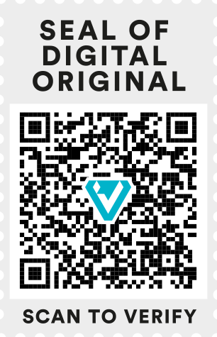
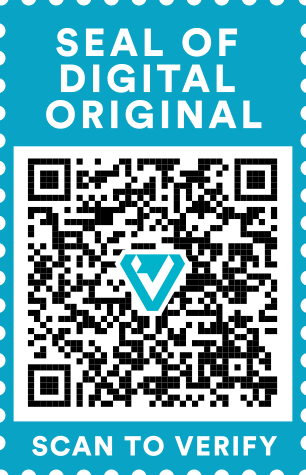
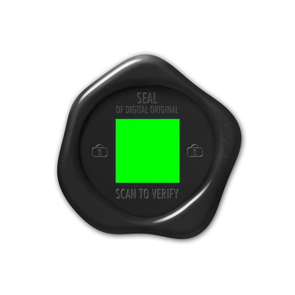
Given this needs to work on documents, and survive printing out without getting too ugly, we decided to work a bit more in the direction of the abstract version, which ended up with this:

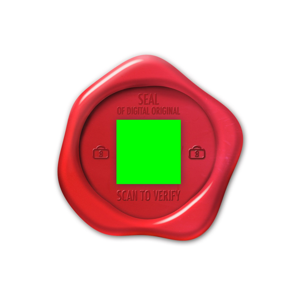
This is the version I then ended up with @giles.vincent to get his take on it. Which resulted in… :drum:

thumbnail_SEAL-Example-SD

as well as

SEAL-Example-SD-v2

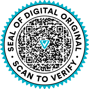
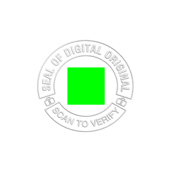
Which I am personally very happy with.

Inputs sought

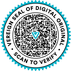
  • @claus.bressmer and myself feel, the “Vereign” in front of “Vereign Seal of Digital Original” is a tad too much. Which is why I’ve asked @zdravko to go with the second one for now. Very little text, to the point, reads immediately… in my book that is a big plus.

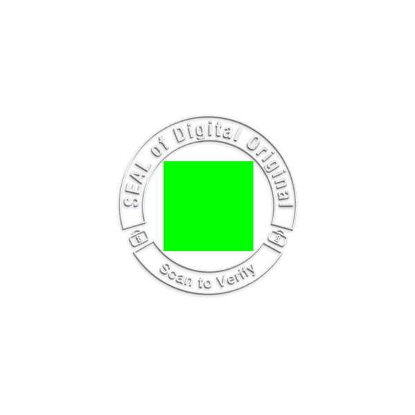
    @giles.vincent however seems to feel it would be better to have more brand visibility here, beyond the checkmark and the border.

    What do you think? Any strong feelings on the subject matter?

  • Now that we have seen this… should we consider to also update the visual seal for emails?

    It could read “SEALED MESSAGE” on top and “CLICK OR SCAN TO VERIFY” on bottom.

    If we feel we need more context / help we could do a small text underneath “To learn more about what SEALed messages, please visit URL” or similar.

Thoughts?

giphy

2 Likes

I like the version with less text (e.g. without vereign).

The other one is harder for me to read.

Here is an alternative version provided by @giles.vincent - which is square and thus more space efficient:

thumbnail_Square-SEAL-Preview thumbnail_Square-SEAL-Teal-Preview

thumbnail_Square-SEAL thumbnail_Square-SEAL-Teal

Thoughts?

1 Like

For me it whould help to see mockups, for the different options. So actually see the different design in action (/applied to a document or email).

Overall I like the round design better for Documents. But I think we might want to ultimatly aim at one unified design for both emails and documents, so in case the round design (for whatever reason) would not work for emails, that would be a downside to be considered for choosing the round design.

Also I am not sure about the ratio between necessary size and QR Code Data. Or in other words: I am not sure how big the round QR Code must be, to contain the necessary number of characters. Hence also for this question it whould help to see the actual design applied to a document also considering the necessary size.

For me the new round design looks better, the only the SEAL OF DIGITAL ORIGINAL and SCAN TO VERIFY should be wayy smaller, because on real pdf it takes too much space.

Unfortunately @giles.vincent came up with the square one because he said that making the text smaller will not dramatically change the size, which is primarily due to the round shape. He wanted to show us a version to demonstrate, but is on vacation this week, so I don’t think we will get much from him this week.

In my view, we can only go with round if we EITHER

  • also use round under email, which is a difficult form factor

OR

  • we decide we can live with two different kinds of seals for different kinds of objects.

Which to me makes this a difficult call.

But yes, I also think the round looks better. :roll_eyes: